Intro to Python for Financial Market Data
Most finance websites show quotes or charts for various financial markets. Where is this data freely available and how can we download it, wrangle it into a useable format, and visualize it ourselves?
A quote for a financial instrument like a stock, currency, or commodity is a snapshot in time reflecting the sum of individual trades happening on the market for this instrument. Data points like price or trading volume are collected periodically to form a historical time series. If we chart this time series, we can visualize the activity of individual instruments, or the market as a whole with an index, and gain a quick overview, and perhaps some insights into the data.
more ...Visualizing Bitcoin OTC Trust Networks
Below is a who-trusts-whom network of people who trade using Bitcoin on a platform called Bitcoin OTC. Since Bitcoin users are anonymous, there is a need to maintain a record of users' reputation to prevent transactions with fraudulent and risky users. Members of Bitcoin OTC rate other members in a scale of -10 (total distrust) to +10 (total trust) in steps of 1.
Let's see if we can produce some meaningful insights by visualizing a snapshot of the network.
Dataset statistics
- Nodes 5,881
- Edges 35,592
- Range of edge weight -10 to +10
- Percentage of positive edges 89%
Sampling
One month sample is used with a broad range of ratings.
more ...Visualizing Historical Bitcoin Prices
This notebook explores visualizing historical price data for Bitcoin. A colorized candlestick chart helps visualize daily price trends and larger time frame price trends together: https://en.wikipedia.org/wiki/Candlestick_chart
Fetching Historical Price Data
- Use GDAX Exchange API: https://docs.gdax.com/#get-historic-rates
- Parse data and coerse into Pandas DataFrame
Candlestick Chart
Use matplotlib and mpl finance library for candlestick support: https://github.com/matplotlib/mpl_finance
Chart shows:
- Bitcoin prices organized by day (in UTC)
- X-axis is Date
- Y-axis is Price at Open, High, Low, and Close of the day
Interpretation
- Color:
- Green candlesticks are "bullish" trend days (increased price)
- Red candlesticks are "bearish" trend days (decreased price)
- Body: Difference between open and close, day's trend strengh
- Shadows: Day's price range, high above open/close, low below open/close more ...
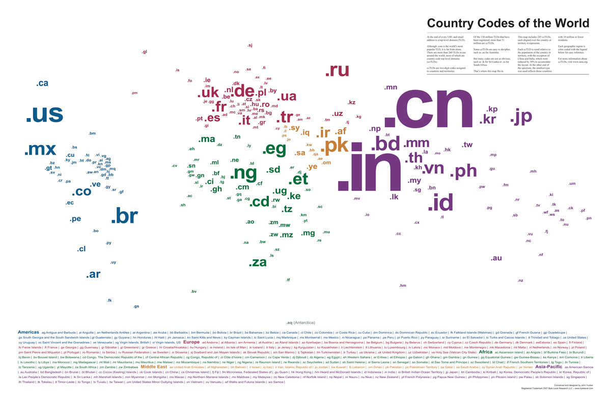
Country Code TLD Visualization

Here’s a really great visualization of the top level domains of the world listed by iso country code and sized by population.
Via: Bytelevel and BoingBoing.
more ...